Introducing the All-New Admin Dashboard
The redesigned Discourse admin dashboard turns a page of scattered charts into a clear, actionable read on your community, so you can see what's working, spot what needs attention, and show the value to your team.

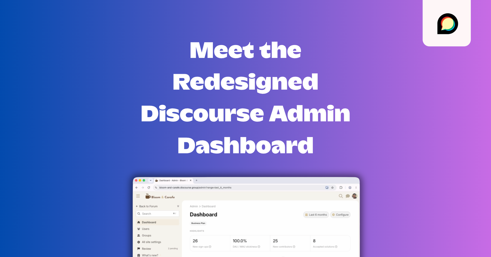
The Discourse dashboard has always given admins a lot of data to work with - and we're proud of how transparent we've made it. But communities have grown, and the ways people measure them have changed; so we took the chance to bring all of that together around the question every community admin actually wants answered:
How is my community doing?
We wanted the Discourse dashboard to be a clear landing page, somewhere admins can go to find actionable information about what's happening in their community, show its value to the rest of their organization, and decide what to do next.
Below is what's new and how you can get started today!
We've also created a video to help you get up to speed fast:
Customization, from the start
During our design process, enterprise admins consistently highlighted one key theme: even limited control over content visibility and presentation would be hugely valuable; so we started there.
Through the configure button, you can turn sections on or off depending on whether they apply to you, and rearrange things so that what you care about most is easiest to see. We did our best to ship smart defaults, but since every community is a little different, we've left the customization up to you.
We also built a more flexible date and time selector, with presets for common ranges and the option to set a custom one, a small quality-of-life win you'll appreciate every time you narrow in on a specific window!
The sections
Past the admin bits, the dashboard is organized around how our top communities measure success.
Highlights are top-of-mind KPIs. Testers asked us, "wait, what does this actually mean?" - so we added tooltips wherever they made sense, defining what we can so nobody's left guessing.
Site traffic keeps the metrics admins have long relied on and adds a few new ones: the percentage of traffic that's direct, how much is logged in, session duration, and a bounce rate based on Google's definition, so it matches what you'd expect elsewhere. You can see where visitors came from before they arrived on your site, and which countries send the most traffic.
Reports is one of our favorites. You can pin any standard report or prebuilt queries to your dashboard. Business and Enterprise customers can also pin up to 10 custom Data Explorer queries - which means no more digging into Data Explorer, opening the query, and running it every time. The data you care about most is right where you want it.
Engagement covers how people consume your content: daily and monthly active users, engaged users, new signups, and a trust level pipeline that shows members climbing the ladder over time. Every community manager wants people moving from lower levels to higher ones, and now you can watch it happen, along with who's posting and how activity breaks down by category.
Search is new. It shows what people search for, whether they find results, and whether they click through. That last part carries a lot: when people search for something and don't click, the content they want probably isn't there, and you've found a gap to fill.
Support is new too, and it appears if you have at least one category using Solved. You'll see resolution rates, how many topics get marked as solved, where staff gets involved, and how long replies take on average. If your community handles support in public, with your team and the members who've become experts answering together, this is where you'll see whether that's working, and whether members are starting to answer each other's questions.
Drill down instead of drowning
The dashboard stays high-level on purpose. It doesn't try to show you everything you might want to know, but it does give you a powerful jumping-off point. Click into a KPI or a chart, and you drop into the deeper report behind it. Which searches ended without a click? Which support topics never got an answer? Start at the summary, then go as deep as you need.
Build a chart just by asking
On our Business and Enterprise plans, you can create a Data Explorer query with AI. Describe the chart you want, say "daily active users over monthly active users, smoothed to one-week periods," and it writes the query, renders the chart, and lets you refine it in place. You can still write SQL if you prefer, but you no longer have to. Data Explorer now opens up to people who don't write SQL, or who want to save time. Once you've created the chart, you can pin it to your dashboard for instant access.
When you don't love what the numbers say
We've thought about this one a lot. A dashboard that shows you more about your community will, sooner or later, tell you something you'd rather not hear. Maybe people sign up and drift away. Maybe support is hit or miss. Nobody enjoys logging in to be told they're falling short.
But knowing is the first step to fixing, and you don't have to figure it out alone. If your numbers surface a gap, here's where to turn:
- Learn from other builders on Meta. Our community of Discourse admins shares knowledge, insights, and hard-won advice every day. The Community Building category is a good place to start.
- Dig into our guides on running communities. We've written about kickstarting a new community, organizing it as it grows, and creating content that drives real traffic.
- Want a partner, not just a platform? On our Enterprise plan, our customer success team helps you define what success looks like, onboard your team, and stay on track with regular check-ins, so the numbers keep moving in the right direction.
How to turn it on
The new dashboard rolls out through our upcoming changes system. It's in beta now, which means it's turned on by default for self-hosted, Pro, and Business plans. Other customers can opt in early through Upcoming Changes.
What's next
We're not done! Better crawler detection is coming, so those "anonymous" numbers reflect real human visitors instead of unlabeled bots. We're exploring smarter grouping for search terms, more ways to define your own KPIs, and saved dashboard views, so different admins and different stakeholders can each look at what matters to them without stepping on each other.
A lot of hands built this one across product, design, and engineering. If you try the new dashboard and have thoughts, drop them on the admin dashboard topics on Meta.
That's the surest way to get your feedback in front of the whole team, and the more we hear, the better we can make it!
Comments