How We Built Horizon with Design Driven Development

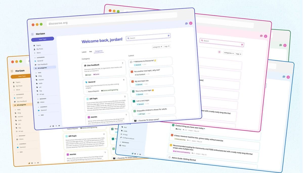
Horizon is a simple, beautiful theme designed to provide a great user experience for communities without extra effort on the admin’s part.
Like most open source software organizations, Discourse started out being primarily engineering driven. The core developers built much of the functionality before a pair of designers were contracted for the design work. Eventually, a full time designer was hired in 2017, almost 4 years after the initial launch of Discourse. As we hired more designers and product managers, features began to be developed around the structure of a product team; made up of engineers, a product manager, and a designer. While designers were attached to specific teams, they remained members of the larger design team. Peter Merholz calls this structure a “Centralized Partnership.”
Over time, Discourse has grown to appreciate the influence and thinking that our design team makes available to the wider organization. So it was extremely exciting when we decided that the design team would lead one of our biggest projects — creating a new theme, which we decided to call Horizon. The name reflects our hope that this theme expresses a more expansive vision for who can use Discourse and what Discourse communities can look like.
Who Horizon is for and why they need it
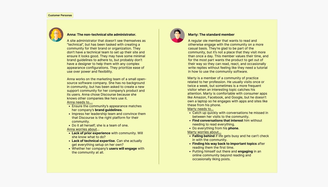
Through customer interviews, we learned that Discourse’s design was generally perceived as “lackluster” and that non-technical users were most underserved by Discourse. These users did not have the skills or resources to alter the default appearance. We used this information to define two personas to target our theme for:
- A non-technical site administrator at a small software company
- An everyday member of a community of practice for educators
We wanted to give our non-technical site administrators a great experience out-of-the-box without the requirement of additional customizations. The everyday member fell nicely between our highly technical power users and anonymous browsers just browsing the forum passively.
Setting up personas for this project helped us stay grounded into who we were designing for, giving us a base from where to guide our critique and analysis of the designs being presented.
Defining design principles
Adding to the foundation already laid with our personas, we honed in on the following list to guide our design principles for the Horizon theme.
- A more colorful, pleasant user experience (dynamic and colorful category indicators, allowing emojis / icons to be used for category badges)
- Increasing readability and reducing information overload (simpler topic cards, larger reading font, more spacious inputs)
- A modern design that better matches user expectations for online communities (exposing search in the header, rounded corners)
We wanted to enable users to see, understand, and act with confidence. Our goal was to simplify the interface by removing unnecessary elements or content that does not support user tasks.
The Design process
Having our personas and principles defined at the outset allowed us to have a mutually understood set of objectives and constraints to design within. As a result, we not only had better critiques, but we began to subtly influence the culture and discussion dynamics of the organization to better support critique and feedback.
Starting with inspiration
With an open canvas before us, we began by building a large “mood board” of designs we found particularly inspiring. We pulled from sites that have similar elements to us: Sidebars, chat, content living in cards, posts, replies, etc. Each designer took time posting screenshots to a large board that we sorted through together in one of our design sessions. From the pile, we pulled the UX items/elements we loved the most and it became the foundation board to begin the work.
Iteration, Feedback and Critique
Charlie, the designer for the member experience team, took the lead on the project. We began with simple and rough mockups with little details ironed out. Inspired by Sketching User Experiences by Bill Buxton, I encouraged Charlie to focus on “fat marker” sketching, where she explored ideas in very low fidelity before going into any sort of higher fidelity rendering or mockups. I felt it was important for us to get the general idea and spacing correct before getting into the details.
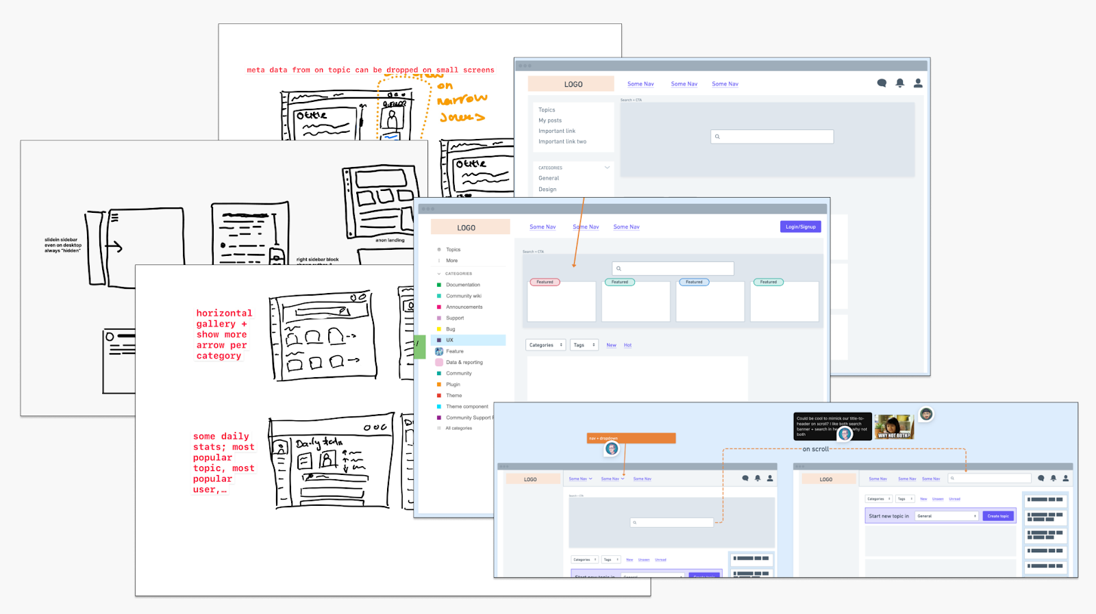
Each teammate had the opportunity to comment, critique, leave feedback, and offer suggestions through our weekly design sessions where Charlie would lead us through her latest iterations, based on the previous week’s feedback.
Charlie would go on to make a new board adjacent to the previous board while incorporating the new feedback. This allowed us to see how the elements transitioned with each feedback session. It helped ground us in what had been tried, and where we were going with the designs.
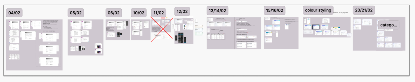
Over time, pieces began to emerge that seemed to need enough design and focus in building that we divided out the work to multiple team members. It was clear that we needed to begin to separate these actionable items into their own respective tasks.
What makes Horizon different
While many items make up the bulk of the Horizon theme, the three in particular that really set it apart are the Topic List Item, Welcome Banner, and Color Palette and selector. While Charlie and the design team continued to iterate on new areas of the theme, engineers from our member experience team and I worked to implement these components in parallel.
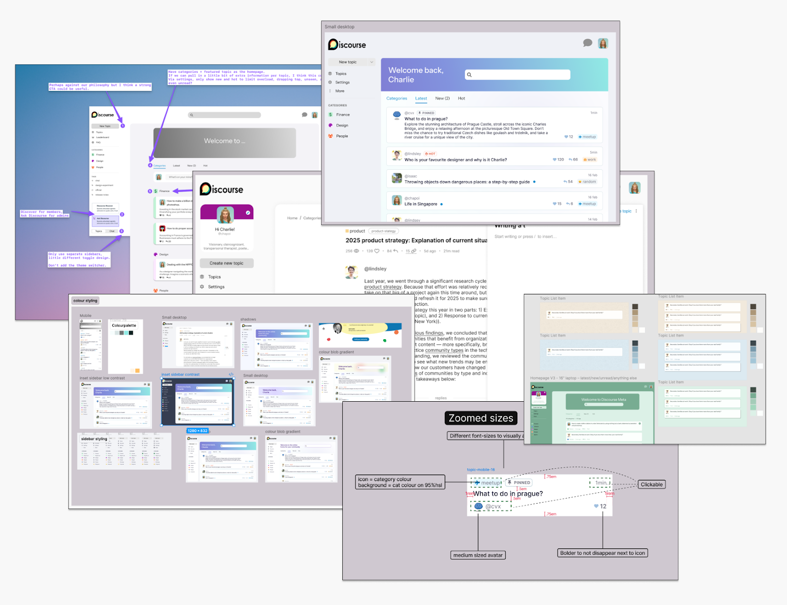
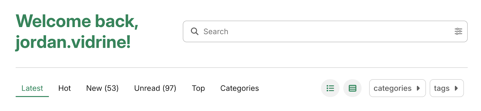
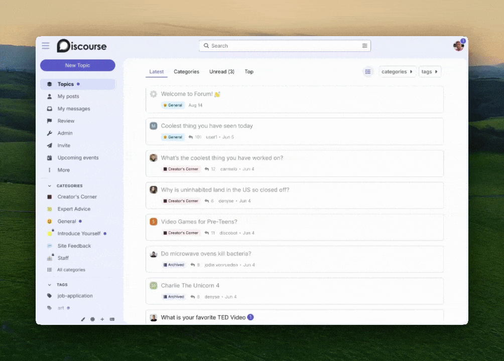
Topic List Item
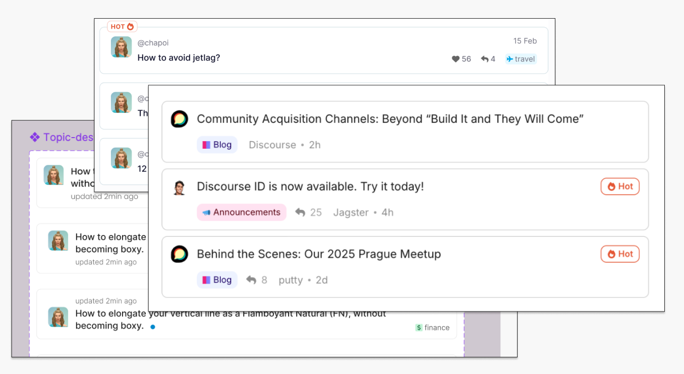
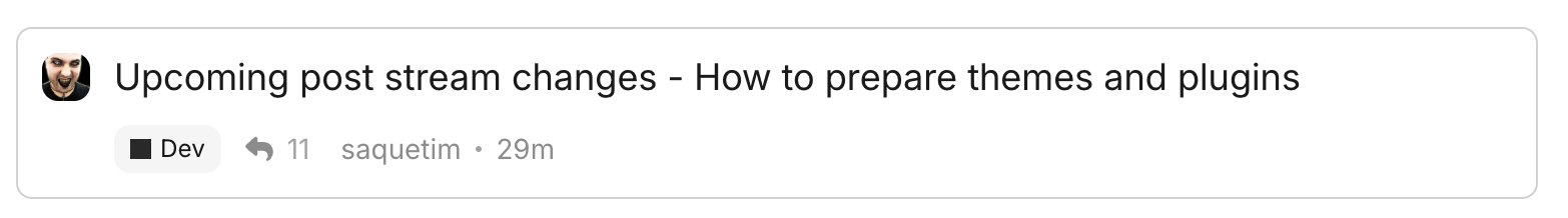
The topic list item is one of the major elements we designed for the Horizon theme. It is different in many ways from the default topic list item from Discourse. Our goal was to simplify the amount of information on the cards, as well as clarify & highlight only the most important bits of information such as: author, reply count, last poster, time of last interaction, category, and if the topic is considered “Hot” with activity.
Before

After
Welcome Banner
While a search banner has always been available for an admin to install onto their site, we decided to make the process easier by porting this popular theme component into the product itself; no longer requiring an admin to know the ins and outs of theme / component installation.
Color Palette and Selection
We built a color system from a set of base colors using the oklch()system. Instead of needing to create a customized css stylesheet, defining which items/areas you wanted to set colors to, a user can now choose just one color to change their entire visual experience. An adorable easter egg we added to this theme were the names of the color options. Clover, Marigold, Royal, Violet, Lily are all names associated with kids of Discourse teammates! In order to have all color names covered, we’ve all signed an agreement that the next child born to a Discourse employee must be named Horizon.
The Maintainability Constraint
While I’ve been primarily speaking about the product and design motivations for the Horizon theme, other factors were also at play.
Opinionated decisions
From the outset, we knew Horizon would be a bit of a departure from other themes, which are built with further customizations in mind. Since we were building Horizon for non-technical admins, though, we wanted to be more opinionated to make sure it was a great out-of-the-box experience.
This meant that the theme would not support most third party components or plugins. This is a decision we still feel strongly about. By keeping the theme scoped to our original vision, we gave ourselves the necessary space to work without the usual constraints. We believe this ultimately led to a better outcome.
We were ok with this because opening up the ability to push this theme further than we intended with customizations would have damaged the overall outcome of Horizon.
Dual purpose
While the Horizon theme was the obvious outcome of our work, we also had our eyes peeled for ways we could make it easier for anyone who wanted to create a Discourse theme. When we found it difficult to customize certain aspects of Discourse, we cleaned the markup and implemented css variables into those areas to help future developers and theme creators to customize the same area.
Minimizing Debt
We worked with engineers on our Developer Experience team to make sure that our additions / changes were not something that would increase technical debt over time. This meant trying our best to utilize tools already built into Discourse that allow us to customize / replace existing elements in a safe and secure way. A small example is how we built Horizon’s topic list item component here.
Testing it all out
We tested out our theme in three primary ways:
- Our internal work community (Dev)
- Our support forum (Meta)
- Select customer site beta testing
The internal and community forums we use for work have 12+ years of discussions built up on them with 100s of users. Testing the theme out on these instances validated a lot of our decisions. These communities gave us many different forms of content to battle test all of the elements of our theme. We were able to get ahead of a large amount of visual and functional issues before a public release using this method, adding polish with every iteration and fix.
After dogfooding the theme for ourselves, we moved onto beta testing. We identified customers who matched the personas we had in mind when designing Horizon. This led us to install the theme for a handful of different communities where we received feedback from both their users, and the administrators who run the forums.
Not all of the users (both internally and externally) who tested Horizon particularly enjoyed some of the opinionated decisions we made. We filtered feedback through our personas to help us decide whether it would make the design work better for our non-technical admin and everyday members.
Key takeaways
Designing out in the open
Our weekly design meetings to discuss and critique the progress of the Horizon theme were summarized and posted publicly to our internal forum each week. This allowed those outside of the design team to see the depth, detail, and iteration we were working toward. This was a great way to spread the influence of design thinking and process through the team. Inviting public discussion helped the design team build trust with other team members as they saw their feedback and ideas incorporated into the project.
Back to the drawing board
Testing with users uncovers needs that you can't always anticipate in design sessions. One key insight was re-thinking decisions we made in our topic list item. We felt strongly that the avatar shown on the card should be the original poster, not the most recent replier. While we still went with this choice, feedback started to roll in that people wanted to also see who replied or commented last as well. This caused us to go back to the drawing board and tweak the positioning of topic list item elements in order to accommodate for that.
Centralized Partnership
This structure worked very well for us on the project. Charlie was the main designer who “owned” the Horizon theme as part of the member experience team, but this did not stop her from getting input from the entire design team. Other designers, along with engineers were also able work together on owning implementation of sub elements of the theme. It was an extremely refreshing way to work with one another and something I’d love to see more of in the future.
What’s next?
Horizon is now the default theme installed when you start up a new Discourse instance.
There are more projects where we’d like to utilize these design driven processes again to tackle in the future:
- New themes available in Discourse
- Exploring category and spaces setups
- Admin and New user onboarding
The success of Horizon proves that design-driven development can be used at historically engineering-led companies. Clearly defined personas and principles, free-flowing feedback, and a commitment to user needs have the ability to lead to undeniable results.
Comments